Español
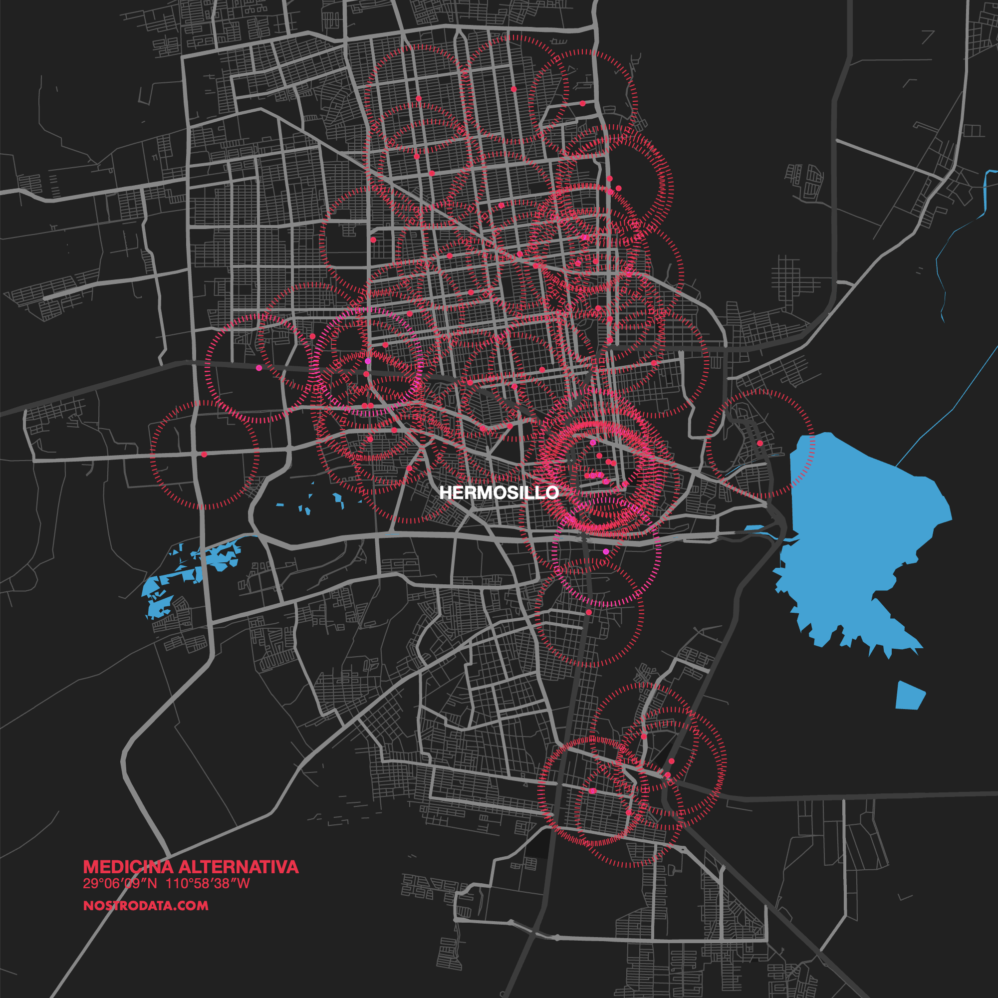
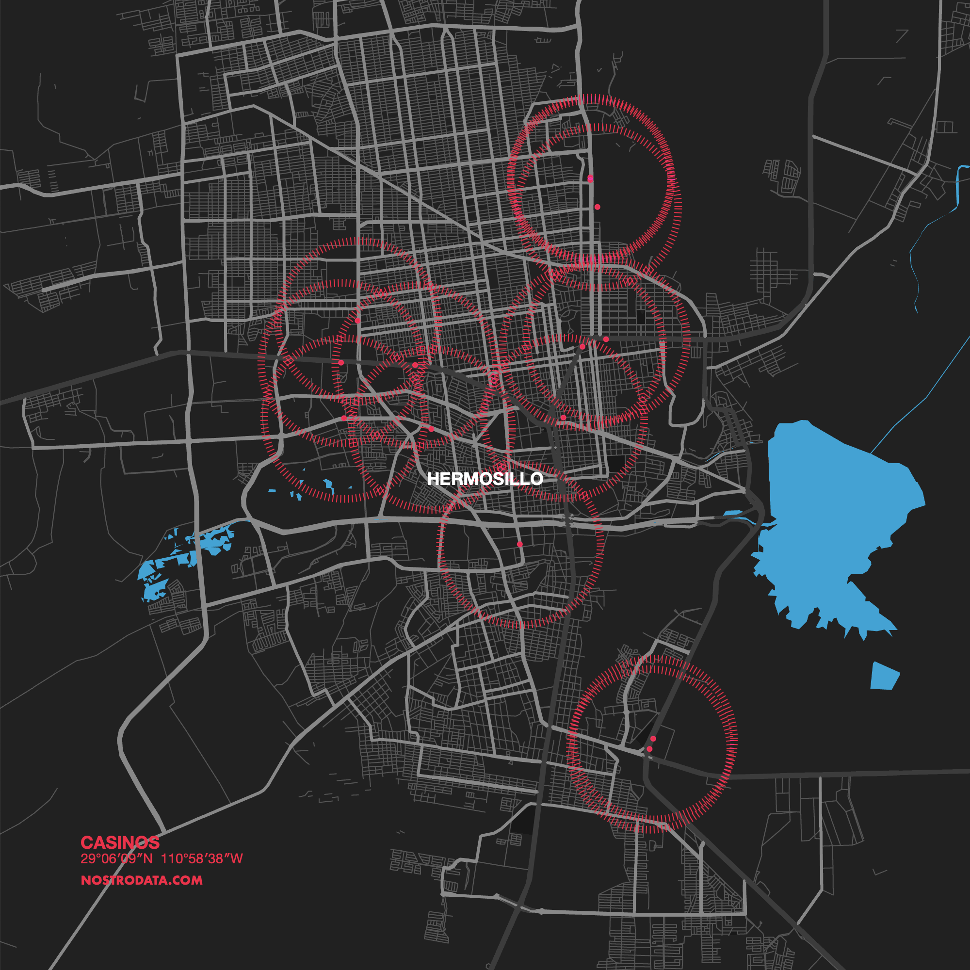
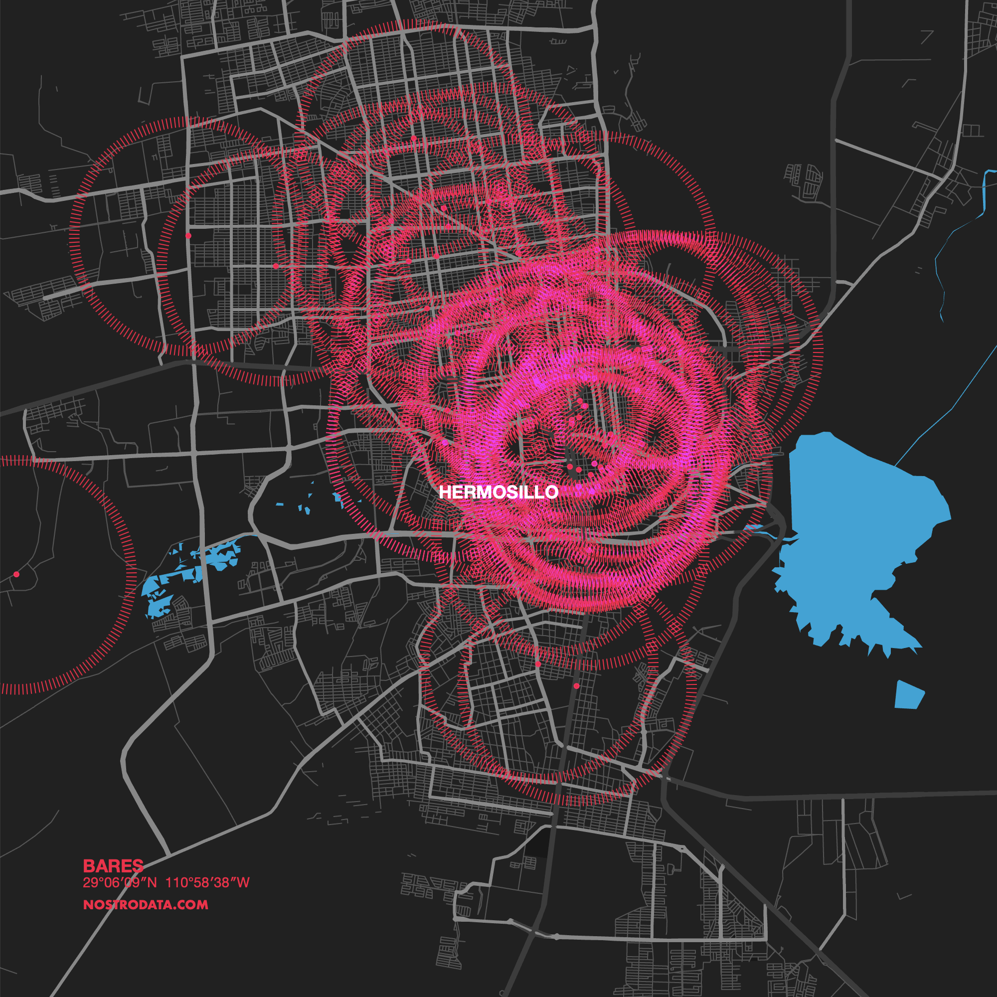
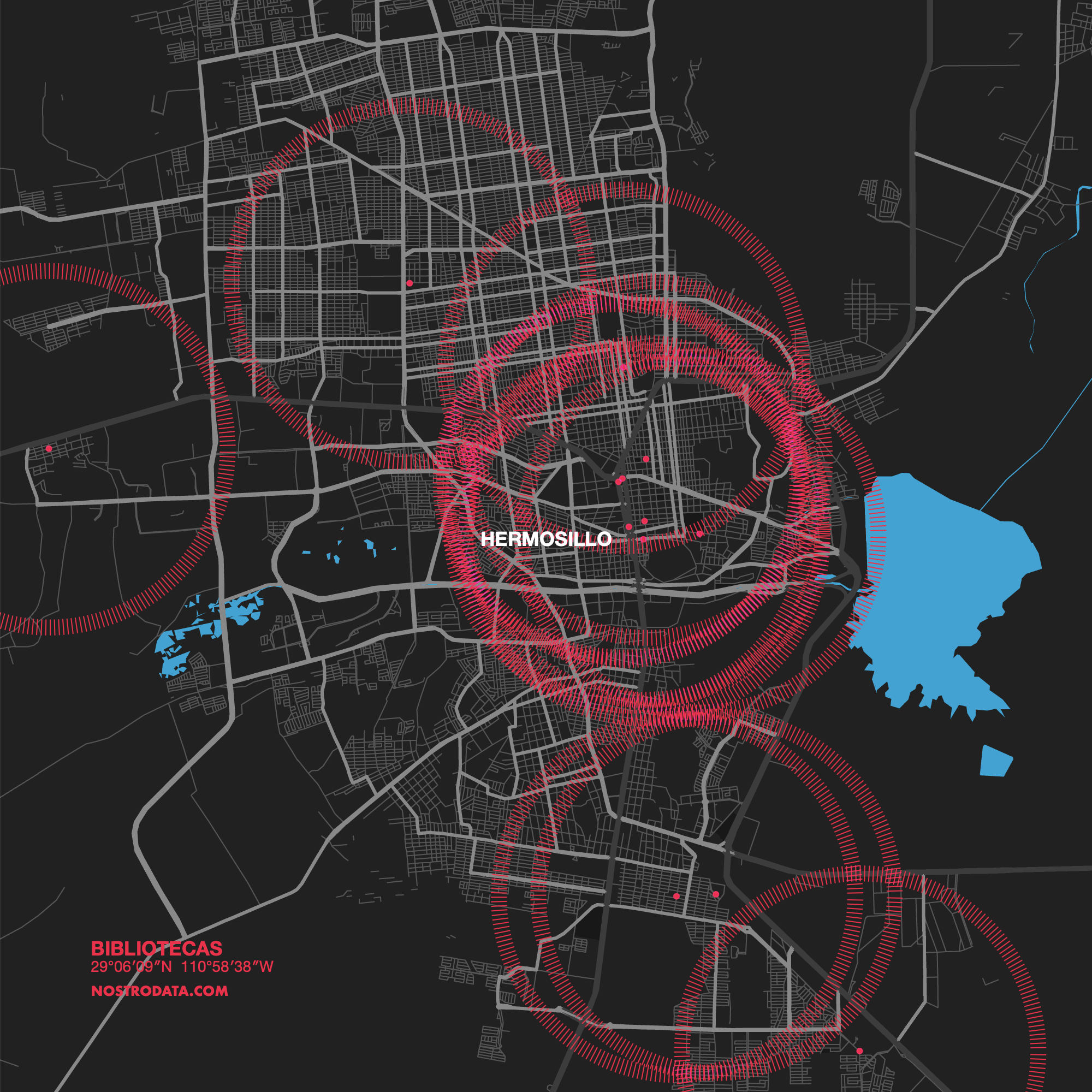
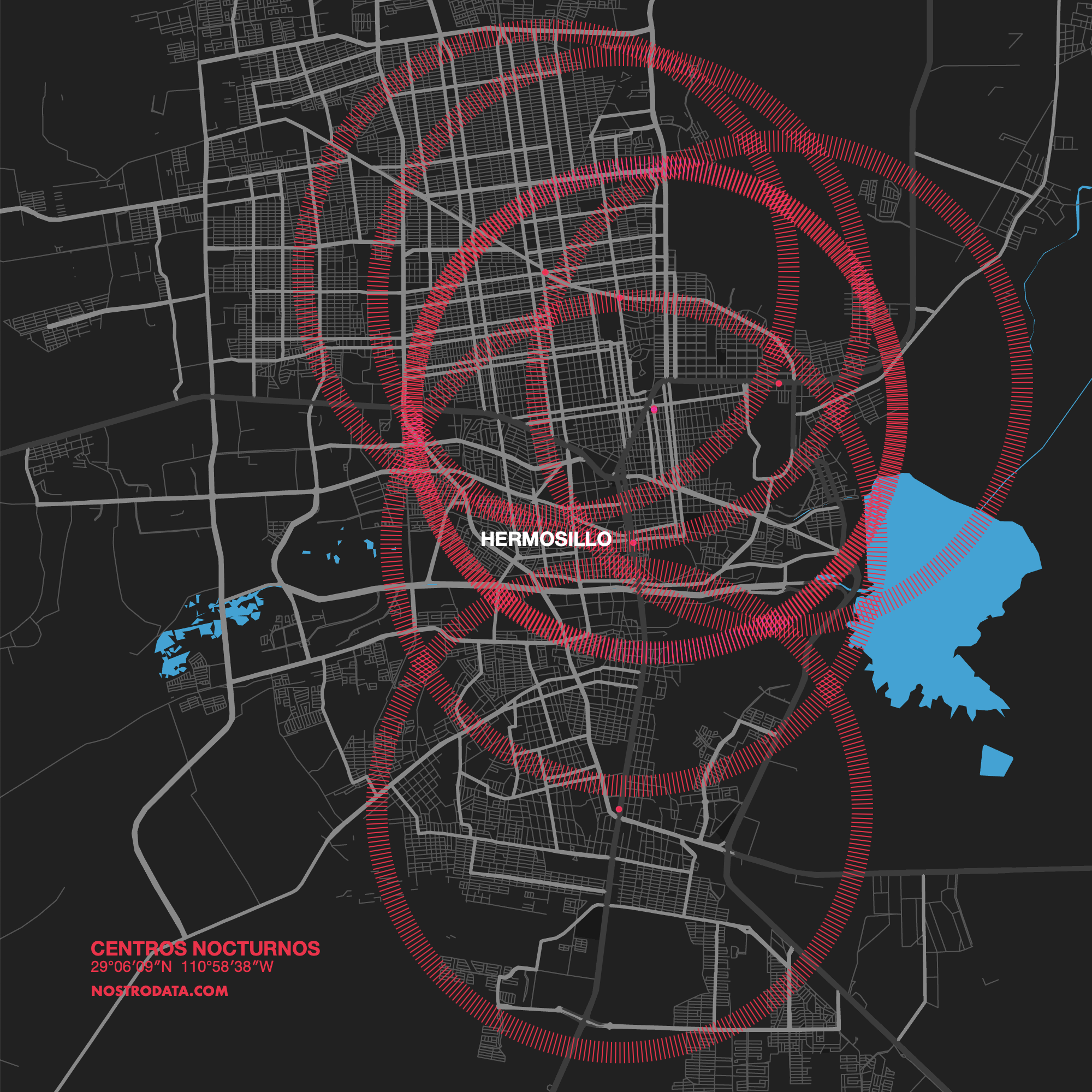
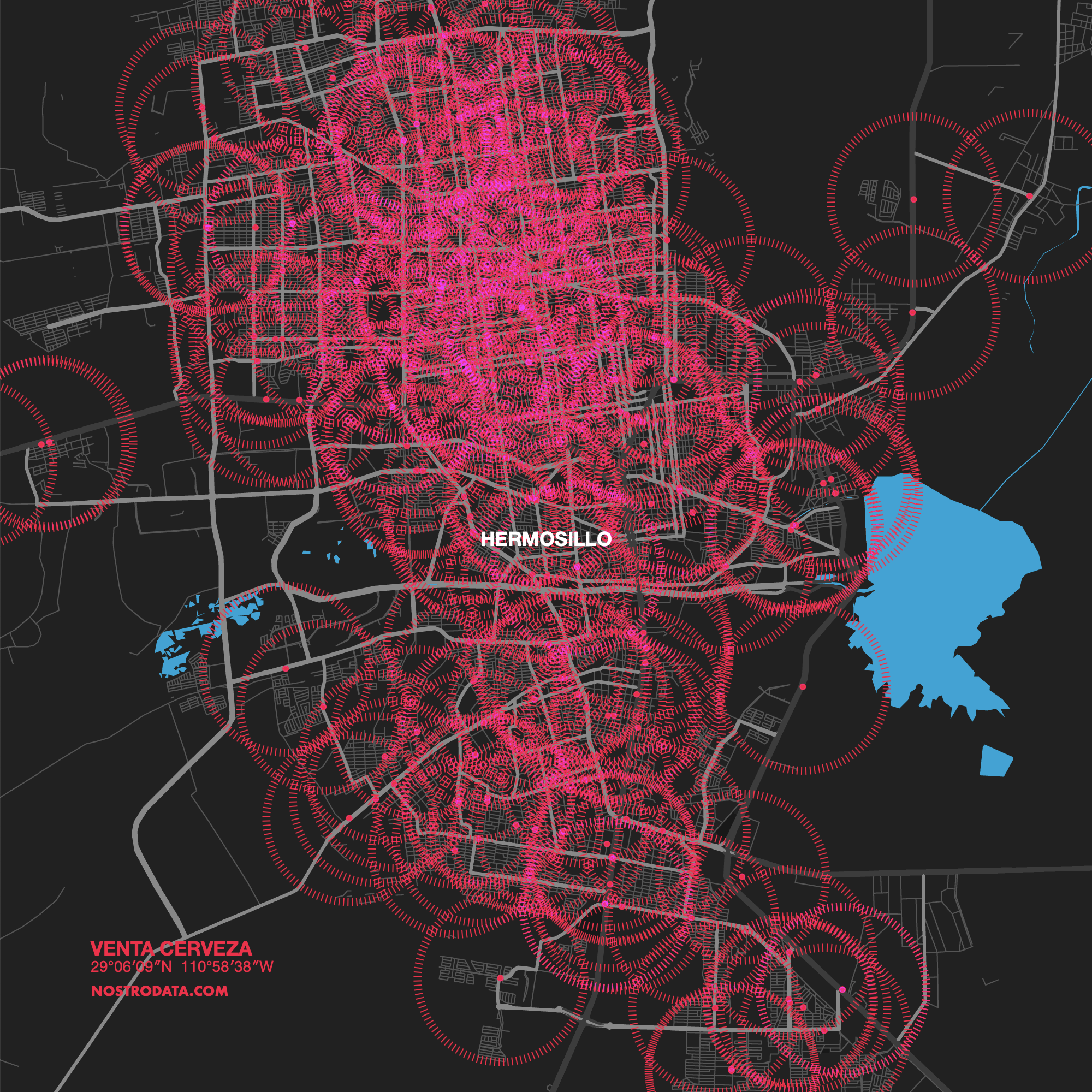
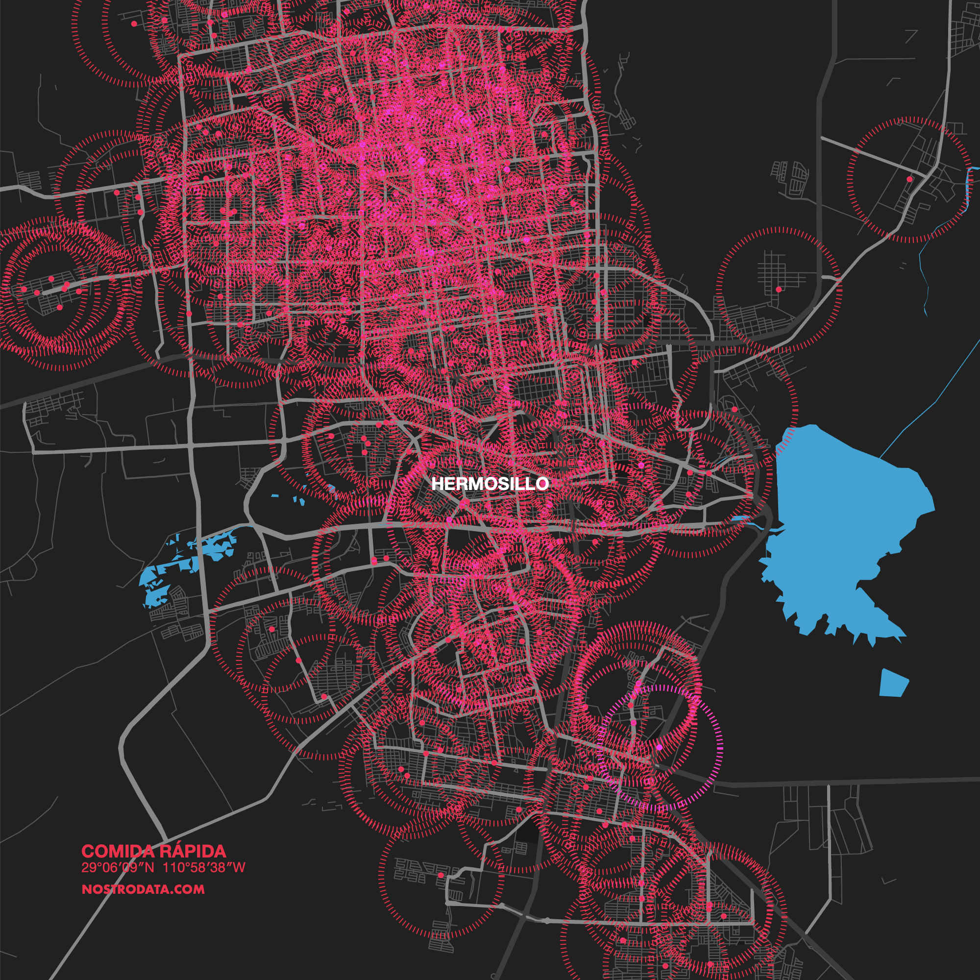
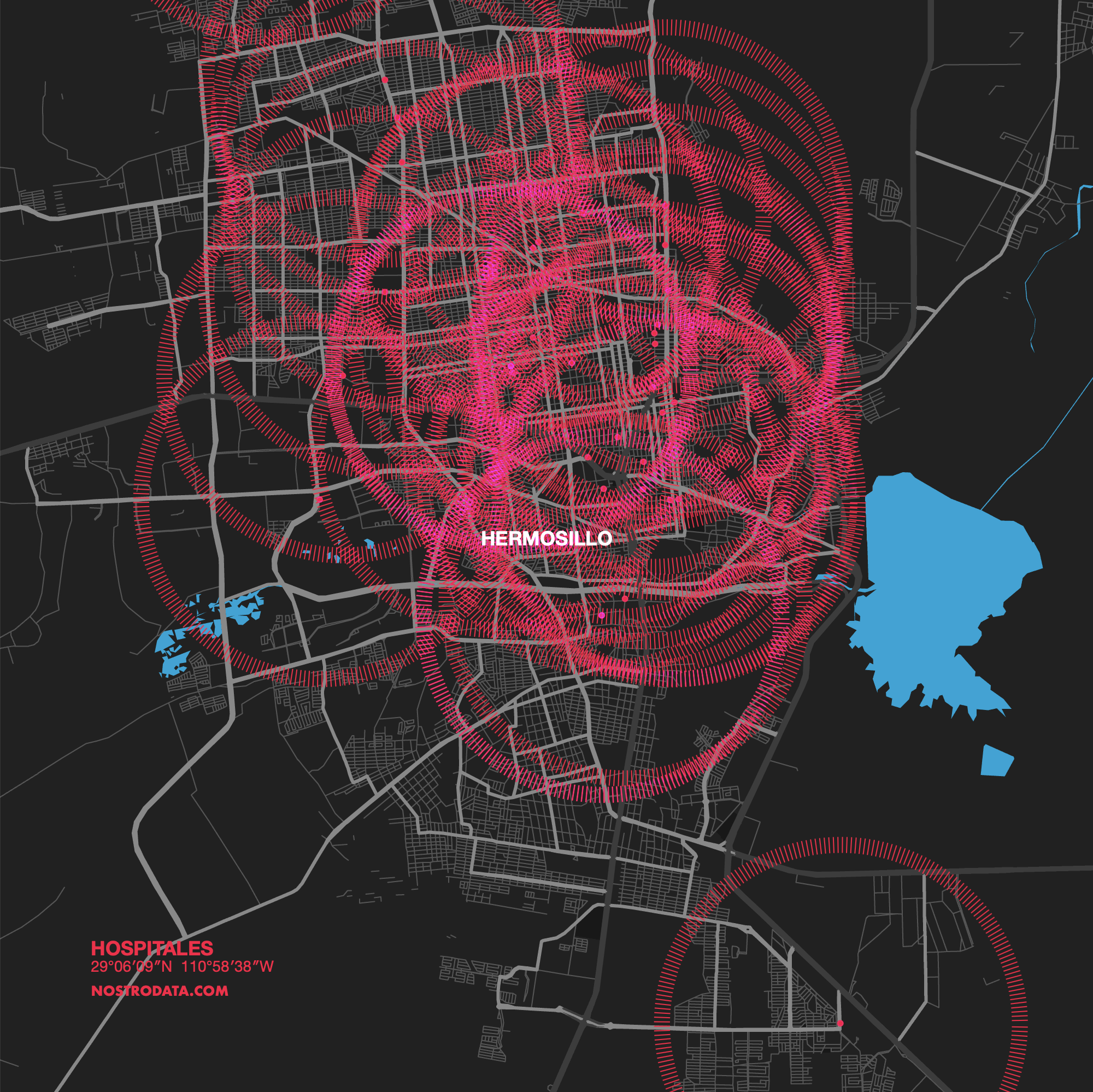
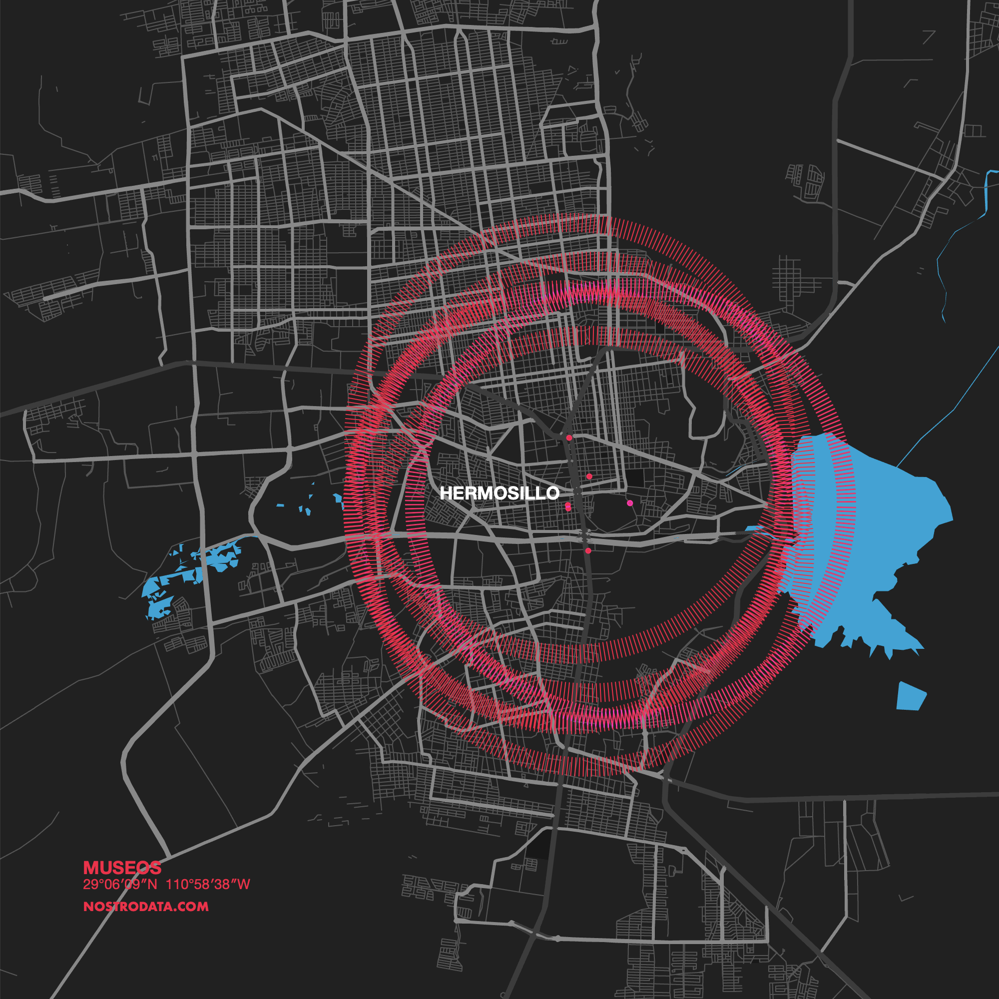
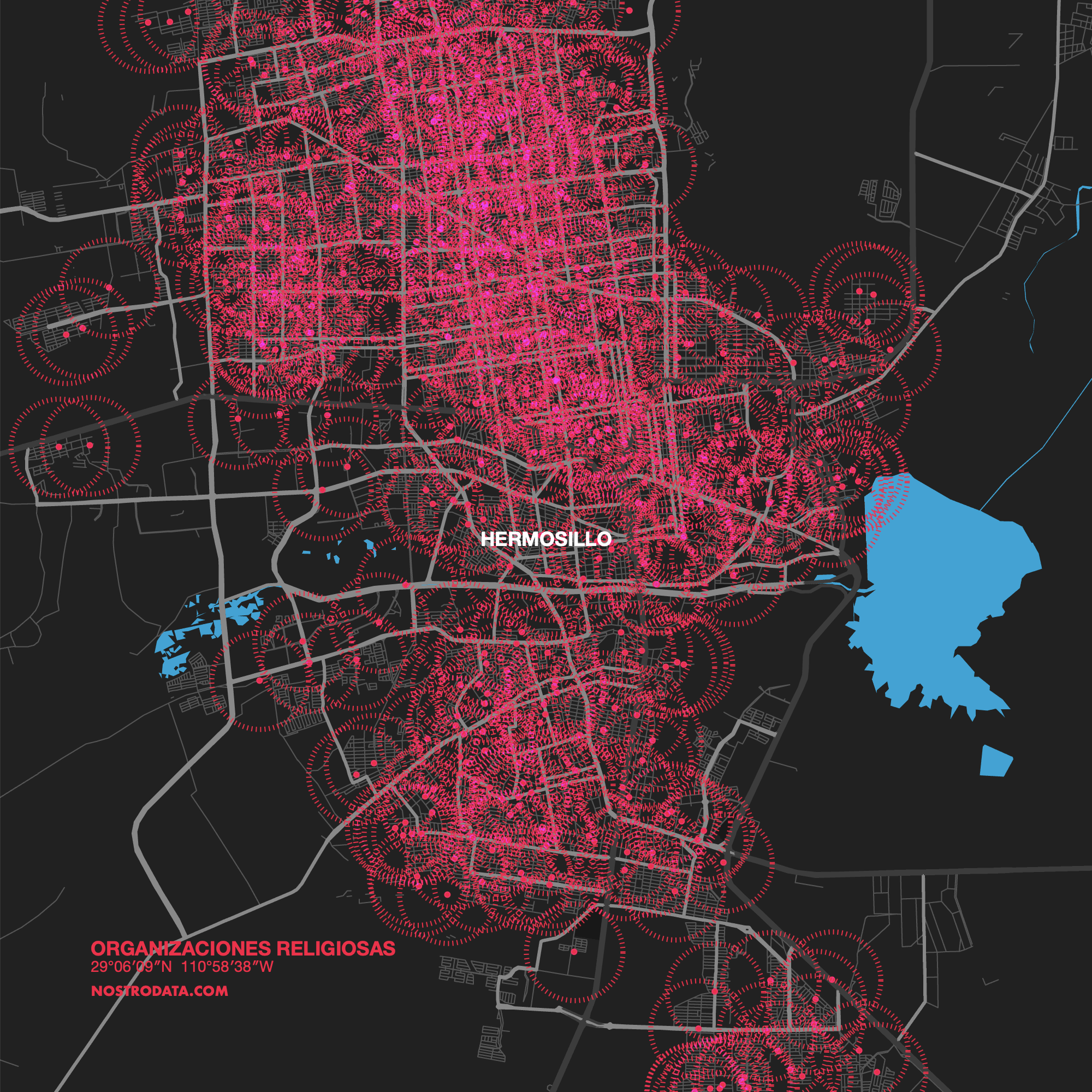
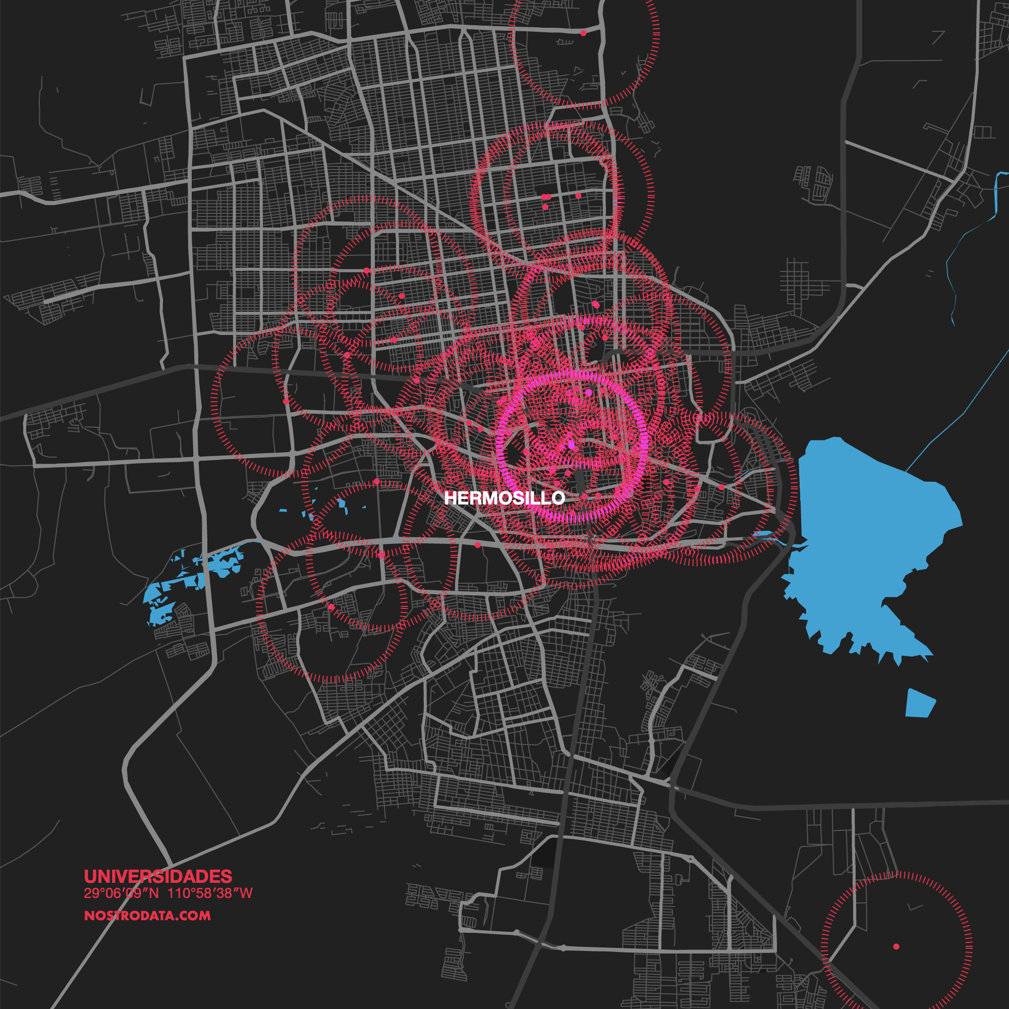
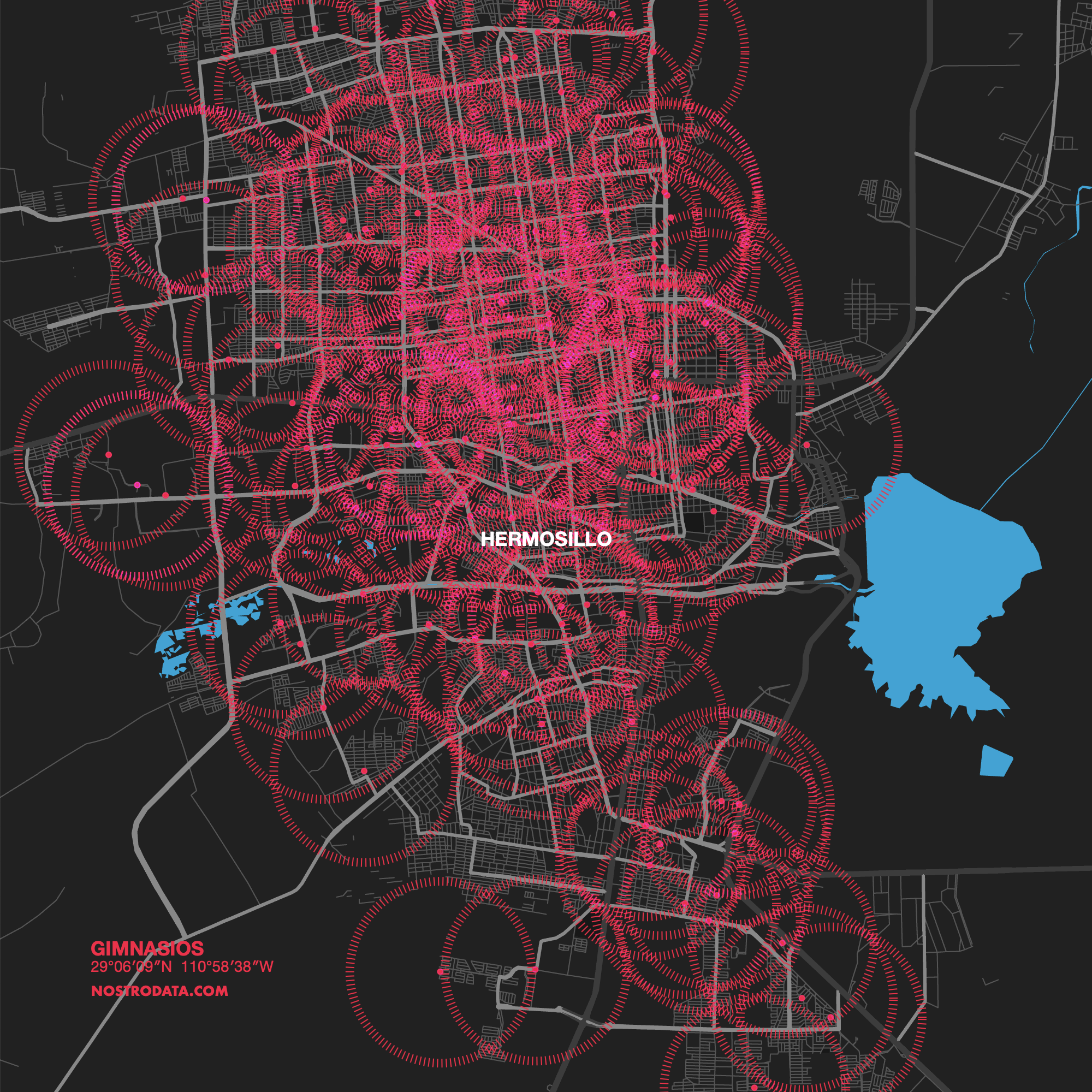
Each image represents the distribution of some points of interest within the city. The circles around each point are obtained from the weighted average distance that a person must travel to find one of these locations. A bigger circle represents lower efficency for a category.