
 Español
All around the world strict social distancing measures are beginning to de-escalate and in a couple of weeks the world will enter the “New Normality”, as is called in Mexico.
As part of the mitigation and contention measures, only essential business and services are operating in our country and in the rest of the world.
The non-essential sectors will be reactivated as the New Normality becomes the norm. In order to keep infections to a minimum in this scenario, the entire population should take precautionary and hygienic measures.
Making the best decisions in these circumstances require guidance. There are several public databases and models developed to evaluate the risk of activities within a business that offer this information
At NOSTRODATA we want that everyone can make informed mobility decisions within their communities. That is why we generated maps that incorporate a “risk traffic light”.
The maps take into account the type of economic activity and the internal dynamics within a business. This is then converted into a number that indicates higher or lower risk to their workers and their customers.
How are the maps generated?
We generate city maps using the National Statistical Directory of Economic Units (DENUE) database produced by INEGI. We extract information about the type of activity for each company, and its size according to the number of employees, as well as its location.
The information is combined with the “risk traffic light” for enterprises published by the Food and Development Research Center (CIAD to define the risk level of each business as follows:
1. Our program defines the business location and its employee number from the DENUE database.
2. Then, a numerical value is defined by considering its economic activity and the level of interaction among its workers and clients for each enterprise.
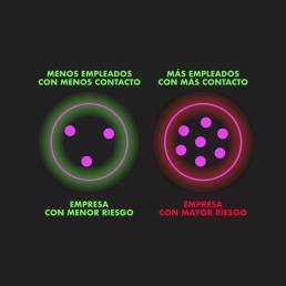
A business with few employees that do not interact between each other means a lower risk enterprise. A business that has more workers with more interactions implies a higher risk.
3. Few high-risk enterprises on the same zone generate high risk areas identified by red zones.
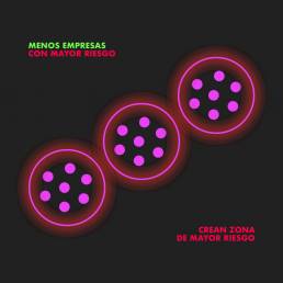
4. Also, several companies with low-risk on the same zone generate high-risk density zones on the map which are also displayed as red spots.

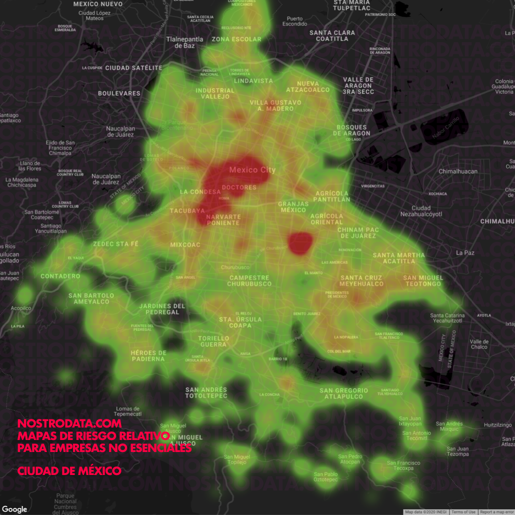
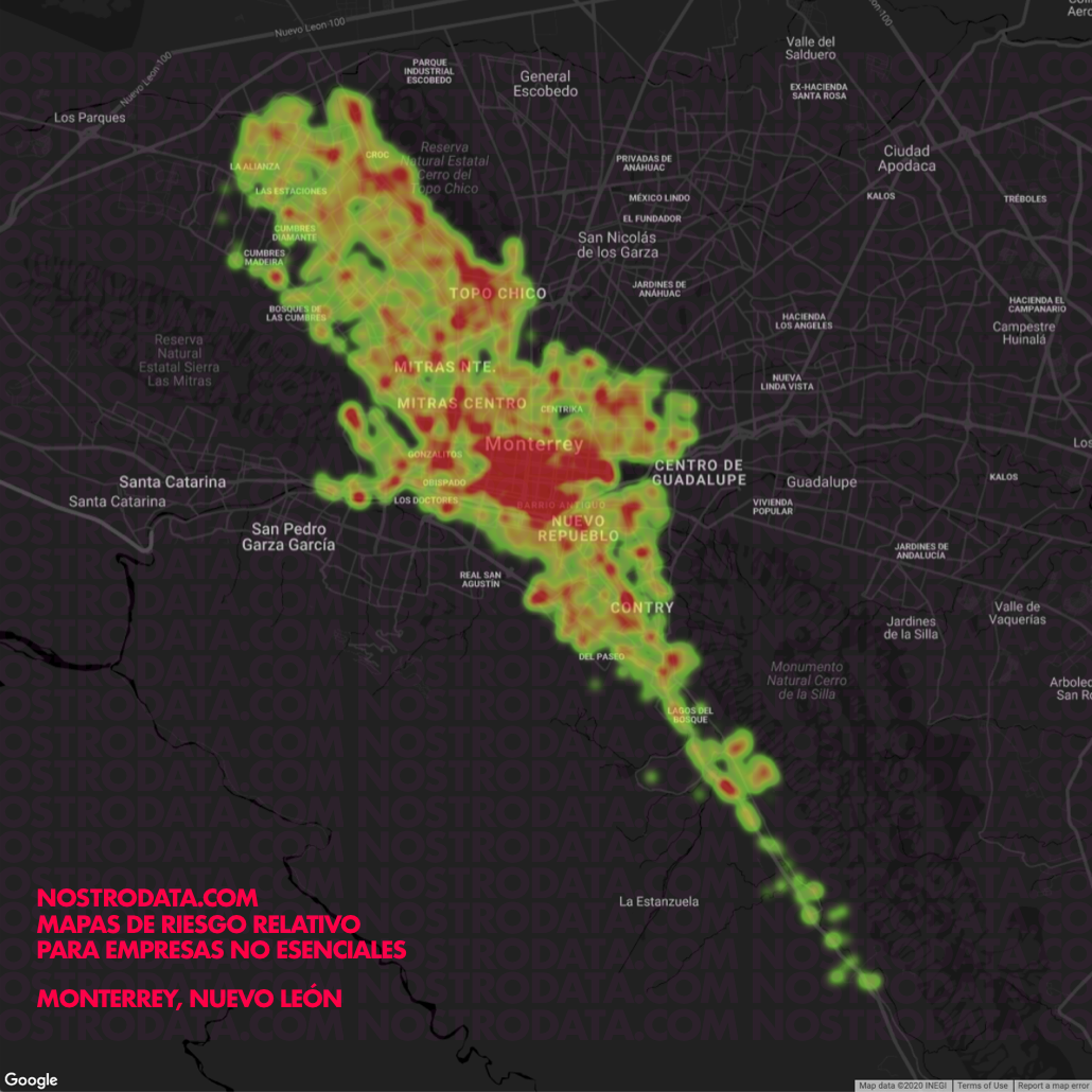
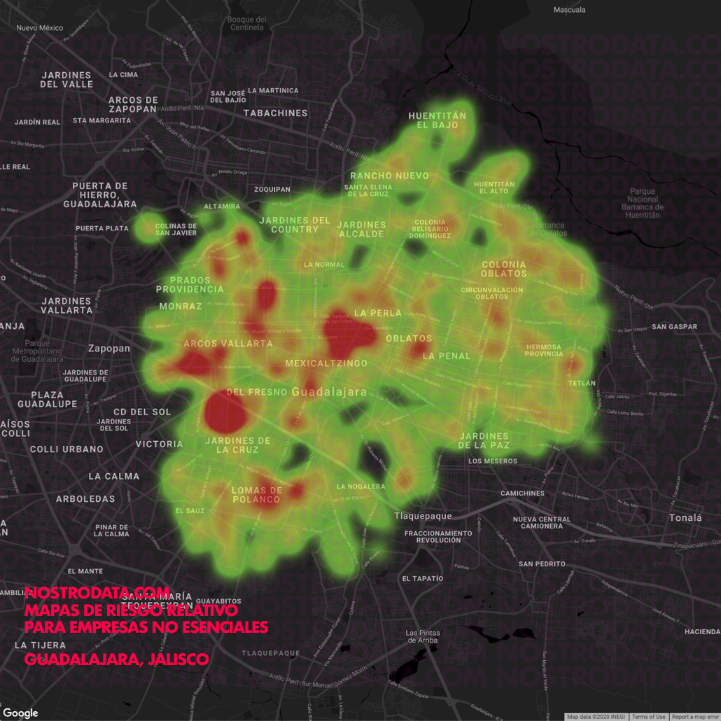
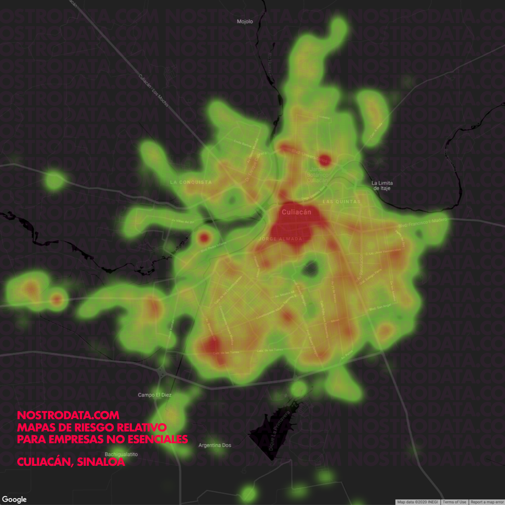
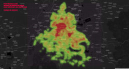
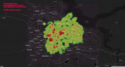
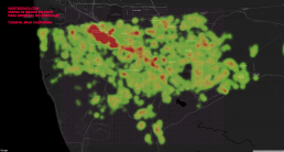
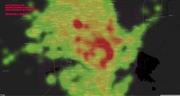
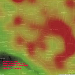
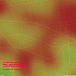
If we consider this risk traffic-light information into the distribution map of each city we get our final heatmaps.
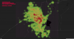
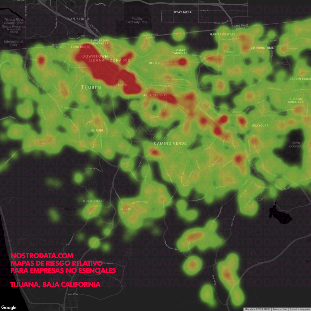
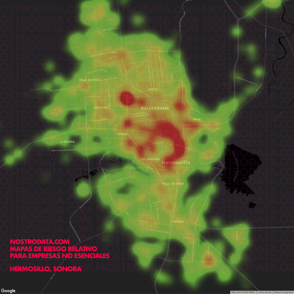
The color gradient from green to red represents the risk of contagion, from lowest to highest, for each economic unit.
The dots will add with each other and the color will be red if there is a high density of business in that zone.
This does not imply that there are more infections or confirmed cases of COVID-19.
It simply indicates that the economic activities of that zone require extra precautions to ensure that the risk of contagion remains low.
We chose some important cities in Mexico to illustrate the results obtained.
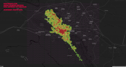
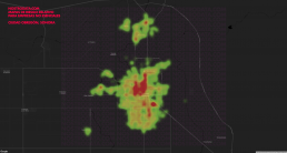
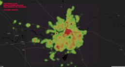
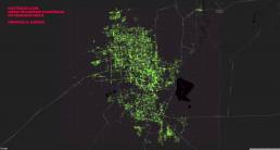
We can additionally zoom in on the map and show more detail as required by the analysis:
If you are interested in learning more about the risk areas of your city, business, area or neighborhood, email us at hello@nostrodata.com
Rocío Bermúdez ( @RociitoB )
Alfredo Manríquez ( @astroAlfredo )
Gustavo Muñoz ( @bustavo )
https://www.onetonline.org/find/descriptor/result/4.C.2.c.1.b